During business design for the Lifelong Learning Entitlement project, our contracting partner identified a need for an additional error page.
They needed content for situations where the service stopped working, but we did not know the reason why. This meant the content could not be specific, like it usually would be. We could not tell users what the error was, but we could give them some guidance on what to do next.
Tell users about a service issue
Before

Analysis
Our third party contractor had created some placeholder content for this situation, but had not raised it with the content team.
I discovered this page while quality checking some of their Figma flows. So, I contacted them to establish the purpose of this page, and where it would sit in the flow.
There were many issues with this content that completely went against the GDS style guide, and looked unprofessional.
Tone issues
1. "Oops! Something went wrong": As a government department, we're writing in usable plain English. Essentially saying "oopsie! My bad!", especially with an exclamation mark is deeply inappropriate. It does not even work as an apology, as it sound insincere.
2. "Something went wrong" is not the most helpful message. While we cannot explicitly say what's wrong in this instance, we can let them know it's a service issue.
3. American spellings, instead of UK versions: "Apologize" instead of "apologise."
4. It's not usually necessary to use the word 'please', as laid out in the GDS style guide. It's not needed for this particular case.
Typos
1. Header titles do not usually have full stops in them. But here, they've used an exclamation mark, and no full stop. It's inconsistent, as well as being wrong.
2. There's a space missing after '...your patience."
3. Stray capital H in "Back to Homepage". It's not needed here.
Passive voice
"...any inconvenience caused". In addition to sounding insincere, the passive voice is against GDS standards. By saying "inconvenience caused," it sounds like this just spontaneously happened to the user. We remove ourselves from being the cause of it, when that's exactly what's happened.
Static content
The contractor has chosen to add a telephone number and email as static text. Our content management system does not currently have content blocks for all content. This means this content would need to be tracked, and updated manually whenever there is an update.
We host a smart answer on GOV.UK that gets users to the right contact they need. This would be the most appropriate direction here. It would stop the risk of this content going out of date in the future, and gives the user more contact options, like our webchat.
Return button
The contractor has not used a GDS component for this button. It is not consistent with the rest of our service design. It's also not necessary, as the user should be easily able to return to what they were doing through the 'back link' component.
The contractor has also missed including the 'back link'. This is necessary so a user can return to their last page in the state they left it. If they've just input data (which is likely), they should be able to go back and try again, or make sure they've saved their progress.
Some default browser back buttons can break site journeys or lose progress, so we know users avoid it.
Our contractor choosing the direct a user back to the homepage is not helpful, as it completely exits them out of their journey.

I've fully rewritten this content in line with GDS standards.
There's a GDS pattern for what they call 'there is a problem with this service' pages. These are also known as '500' or 'internal server' error pages.
The contractor has also not updated the GOV.UK branding to the new style, even though this service will need to launch with that branding.
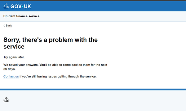
The solution
New content
1. I've updated the GOV.UK branding to the 2025 version.
2. I've rewritten the content to be more usable, and in line with GDS' established pattern.
3. I've added a back link, so the user can return to their application in the same state, and decide what to do next.
4. Given users reassurance that we've saved their answers, they can come back to their application at another time, and told them how long we'll keep them for.
5. Given them a direct link to our most current Student Loans Company contact page. It's possible a user has seen this page multiple times, and we do not want them to feel more frustrated. By giving them a link to the smart answer, they can be directed to the right section to help them deal with their issue, and choose the best method of contact for them. It will also mean we do not have to worry this page can ever go out of date if a contact number changes in the future.
After